
/ Overview
Surf City Squeeze is a responsive web design and UX/UI project created to elevate the online presence of the established smoothie and juice brand. Founded in Phoenix in the early 1980s and known for its proprietary smoothie mix and variety of fresh blended beverages, Surf City Squeeze serves customers across the United States with vibrant, flavorful menu options.
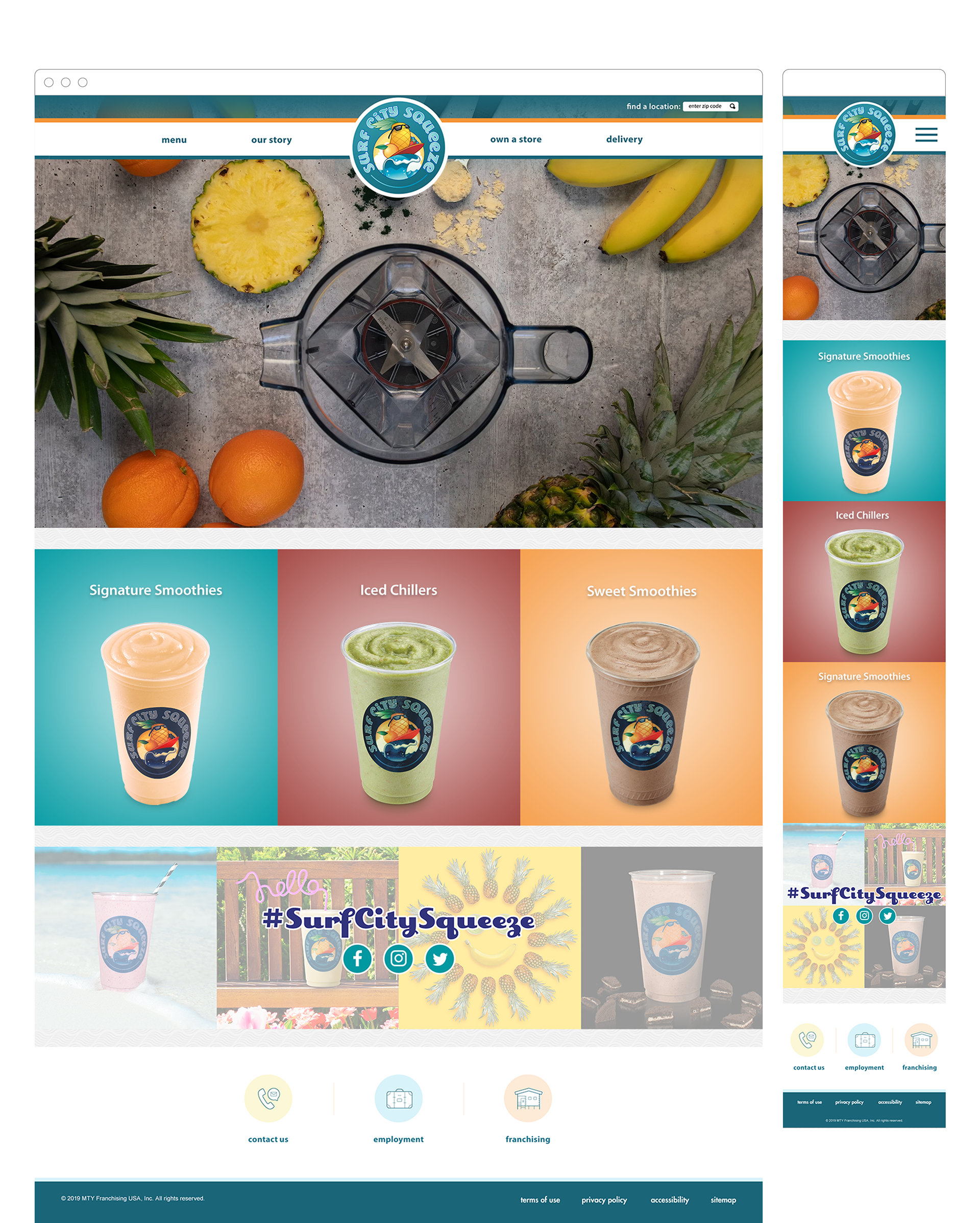
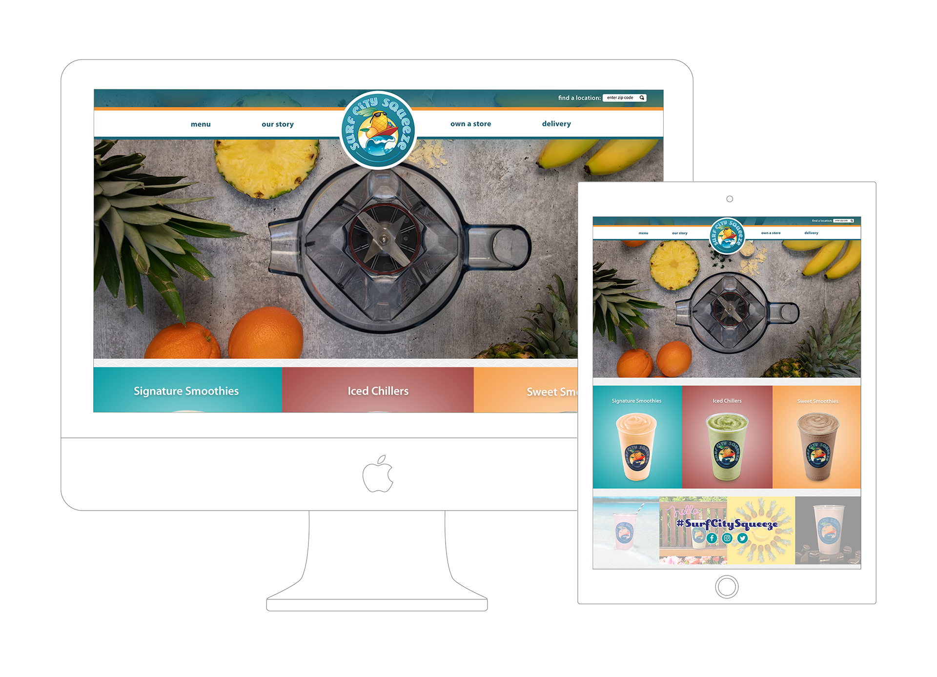
The primary objective of this project was to design a modern and engaging website that reflects the brand’s energetic, health-focused identity while making it easy for visitors to explore menu offerings, find store locations, and engage with the brand online. The final design emphasizes clear navigation, fresh visual layout, and responsive experiences across devices.
/ Problem
Before this redesign, the Surf City Squeeze web presence lacked a cohesive digital identity that matched the fun, refreshing brand experience customers enjoy in-store. Key challenges included:
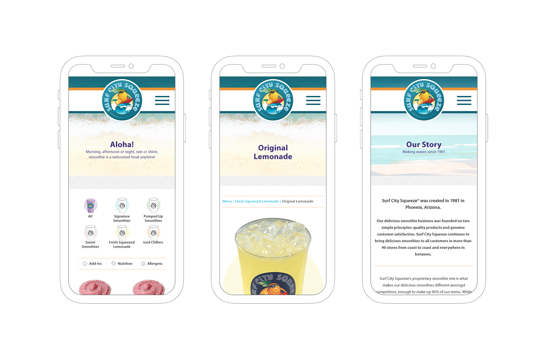
Unclear information hierarchy: Visitors had difficulty quickly discovering key menu categories like smoothies, lemonades, and iced chillers.
Non-optimized mobile experience: Given the fast-paced, on-the-go audience, the site needed to perform seamlessly on phones and tablets.
Weak brand storytelling online: The brand’s rich history and unique product positioning weren’t effectively communicated through the existing design.
The redesign aimed to solve these problems by streamlining content discovery, improving clarity on product offerings, and aligning the digital experience with the upbeat, beachy vibe of the physical brand.
/ Design Process
The Surf City Squeeze website project followed a user-centered, iterative process to ensure both brand fidelity and usability:
a. Discovery & Research
I started by researching Surf City Squeeze’s brand heritage, menu offerings, and customer expectations. Surf City Squeeze is known for its wide variety of smoothies (signature, pumped up, sweet), fresh-squeezed lemonades, and iced chillers — all made with high-quality ingredients.
Key research goals included:
• Understanding the brand’s unique selling points.
• Identifying what users most frequently look for when visiting a smoothie brand’s website (e.g., menu, nutritional info, locations).
• Evaluating competitors to inform navigation and content structure decisions.
b. Information Architecture & UX Mapping
Next, I defined a clear content hierarchy and navigation flow tailored to typical user tasks, such as:
• Exploring the menu by category.
• Locating physical store locations.
• Learning about the brand’s story and values.
Site maps and user flows were drafted to ensure each user journey (e.g., “Find a smoothie” → “See ingredients” → “Locate a store”) was intuitive and minimized friction.
c. Wireframing
Low-fidelity wireframes were created to establish structure and layout without visual distractions. These sketches helped:
• Determine how content blocks would be organized on desktop and mobile.
• Identify the placement of primary navigation (menu tabs, call-to-action buttons).
• Ensure responsive behavior across devices.
d. Visual Design & UI
Once the UX foundation was solidified, visual design brought the brand to life:
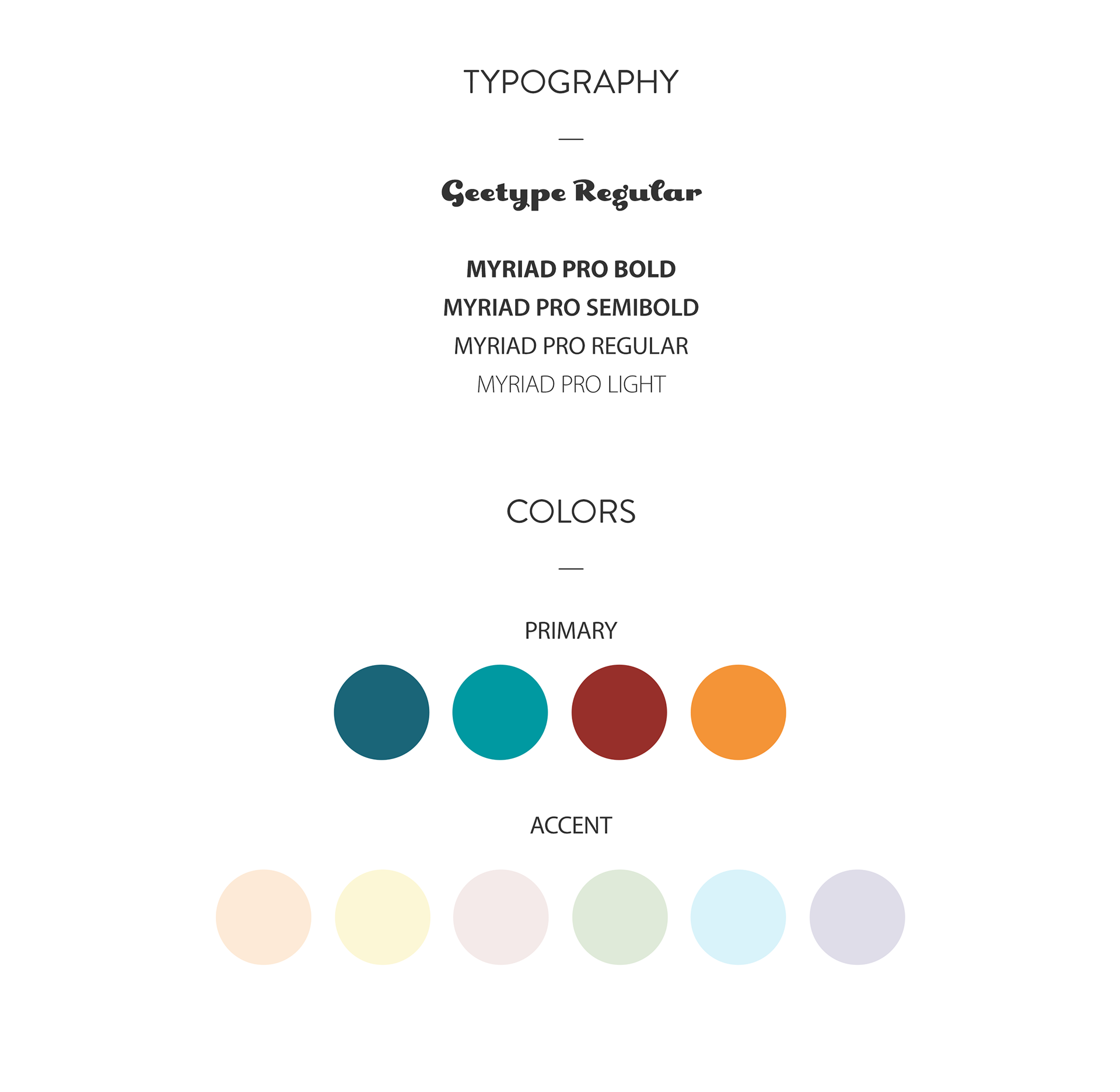
• Color system: Inspired by smoothie hues and refreshing citrus tones.
• Typography: Bold, friendly fonts to make headers and calls to action feel energetic.
• Imagery: High-impact smoothie photos to communicate freshness and flavor.
The design focused on creating a visual rhythm that guided users naturally through the content, from browsing menu categories to finding a nearby location.
e. Prototyping & Testing
Clickable prototypes were built to evaluate flow and functionality before final handoff:
• Tested navigation on multiple breakpoints (mobile, tablet, desktop).
• Iterated based on usability feedback to streamline interaction patterns.
• Polished responsive behavior and interactive elements.
f. Final Delivery
The completed design kit included:
• Responsive UI screens.
• Style guide (colors, typography, components).
• Interaction specifications for developers.
• Asset exports and redlines for efficient implementation.