
/ Overview
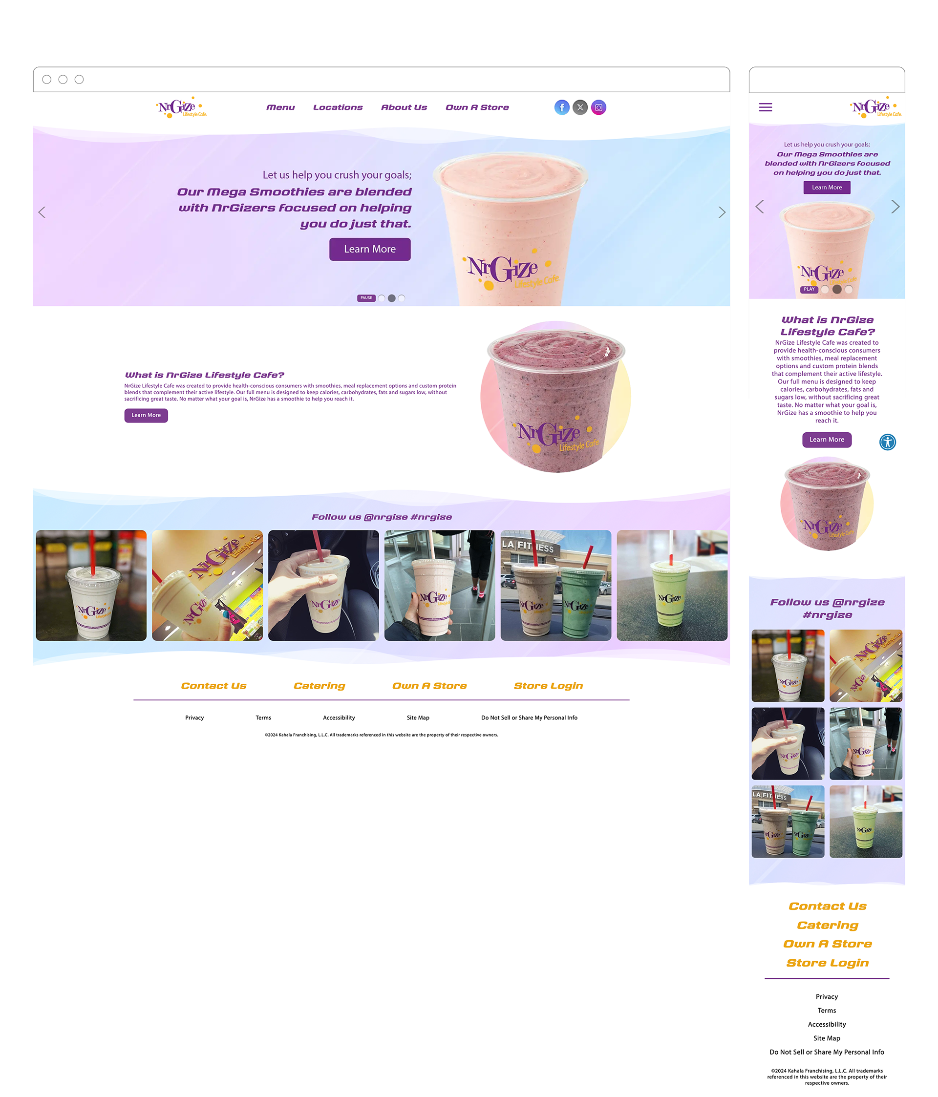
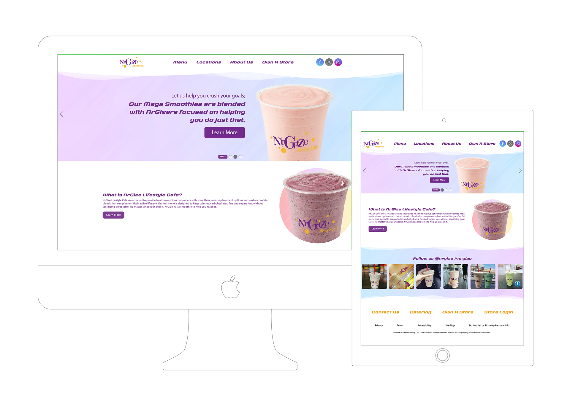
NRGize Juice is a responsive web design and UI/UX project created to represent the NRGize Lifestyle Cafe brand online. The goal was to craft a modern, visually engaging digital experience that communicates the brand’s focus on health, energy, and active lifestyle choices through smoothies, juices, and meal-replacement beverages. The project included designing a fully responsive website, intuitive navigation, and UI elements that resonate with fitness-conscious users looking for quick access to menu offerings and nutrition information.
/ Problem
The primary challenge was that NRGize lacked an effective online presence that matched the energy and quality of its real-world experience. Their previous or nonexistent web footprint didn’t effectively support:
• User discovery of products and menu information
• Mobile engagement for on-the-go health seekers
• Clear brand positioning in a competitive smoothie/juice market focused on health and fitness
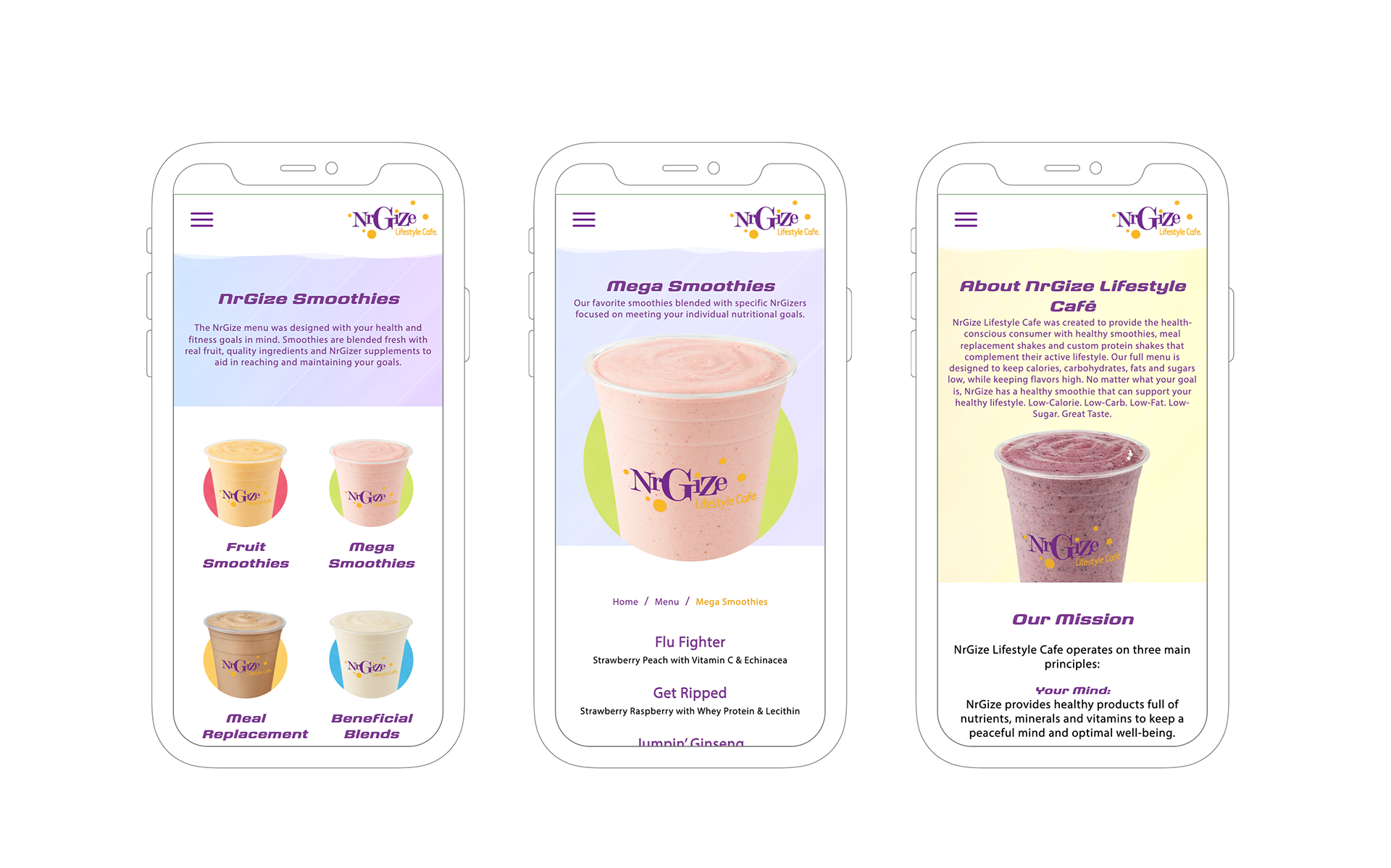
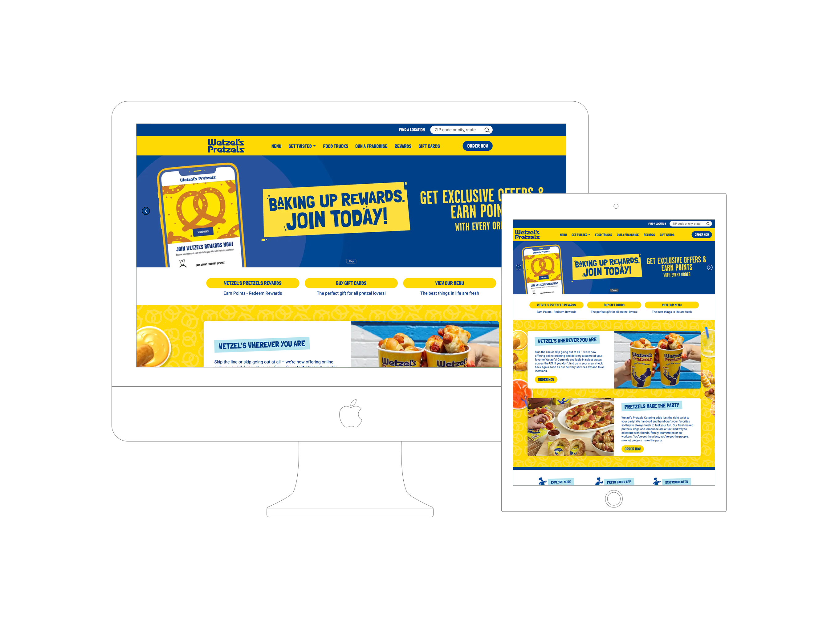
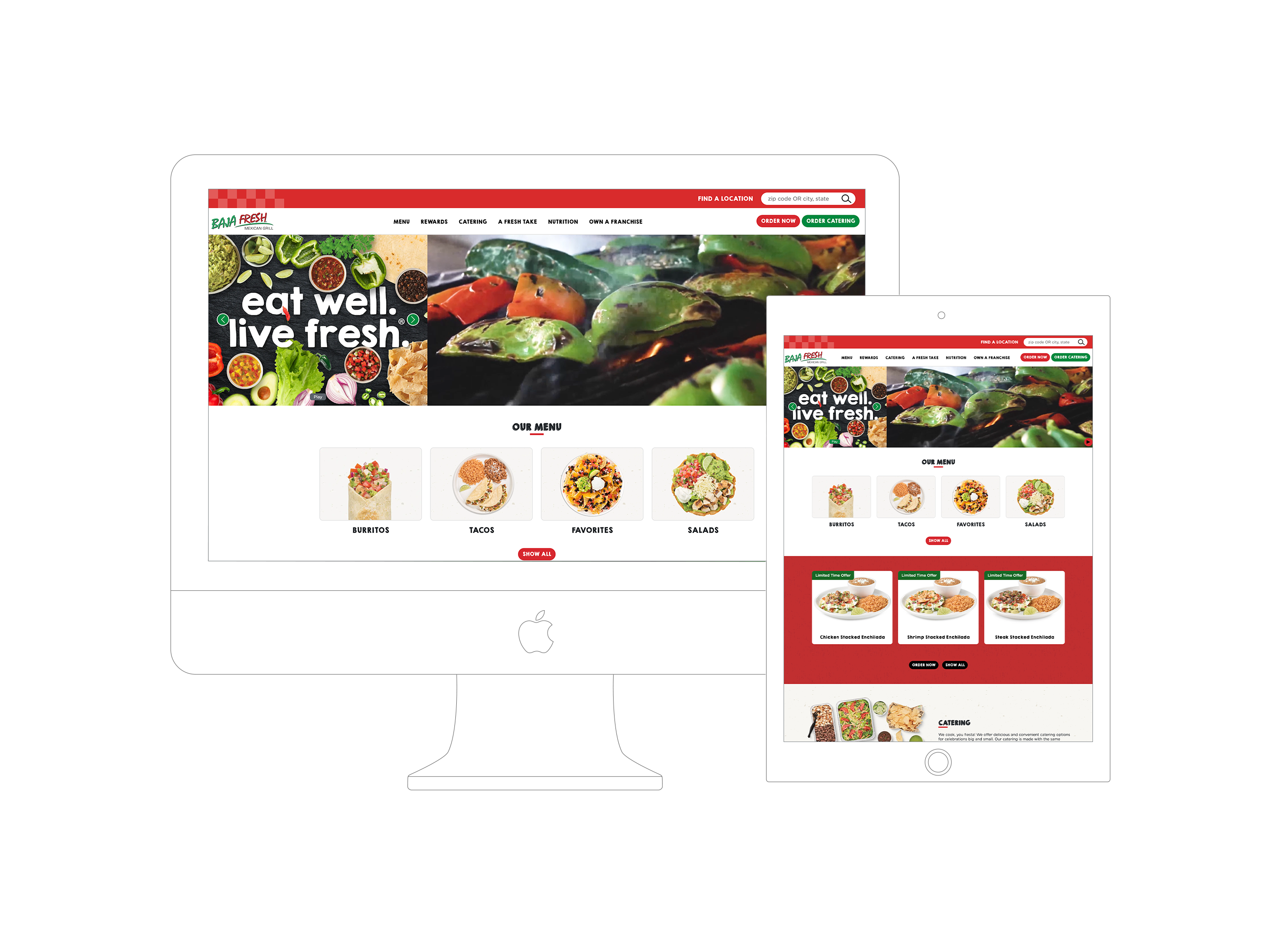
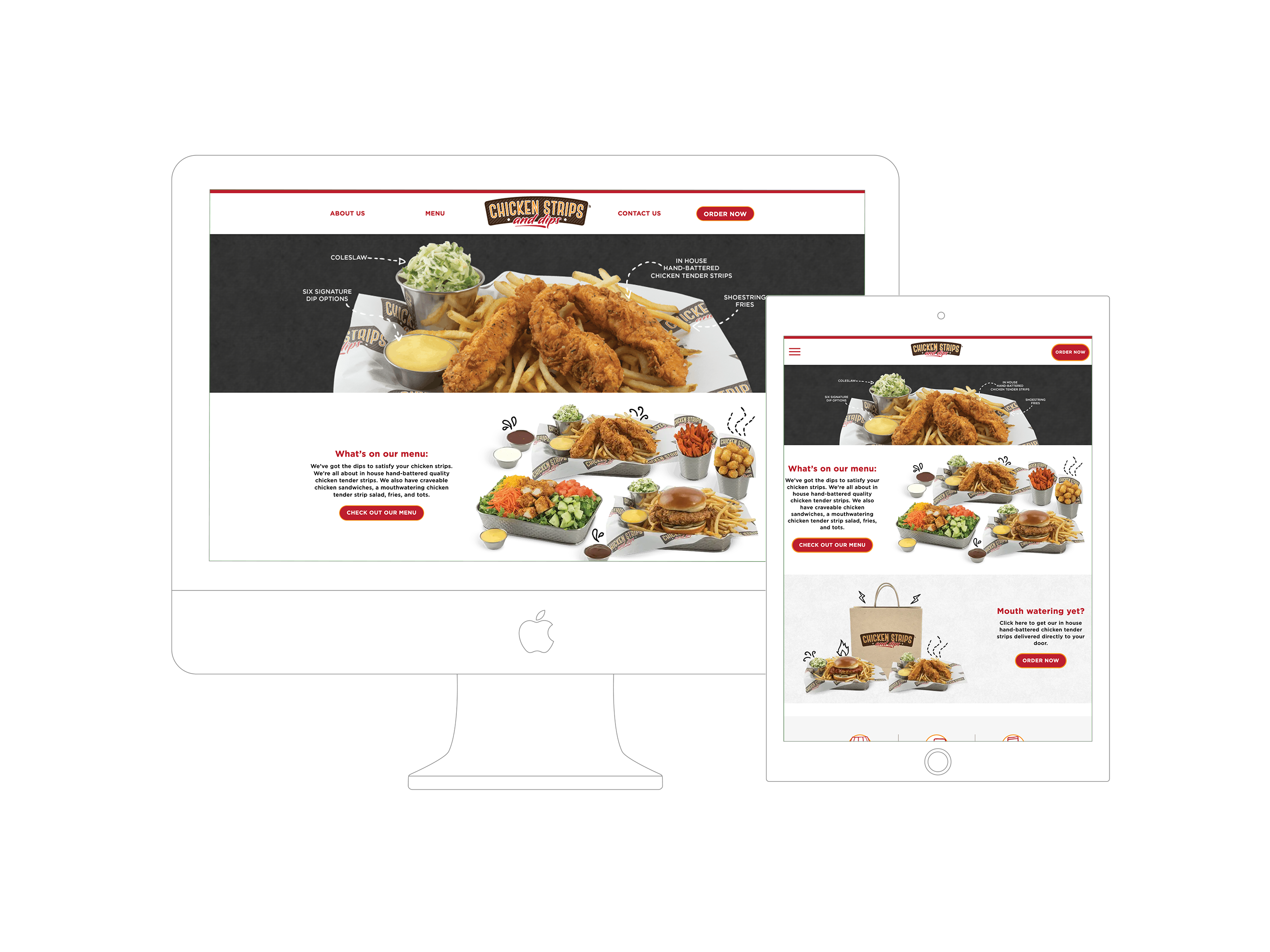
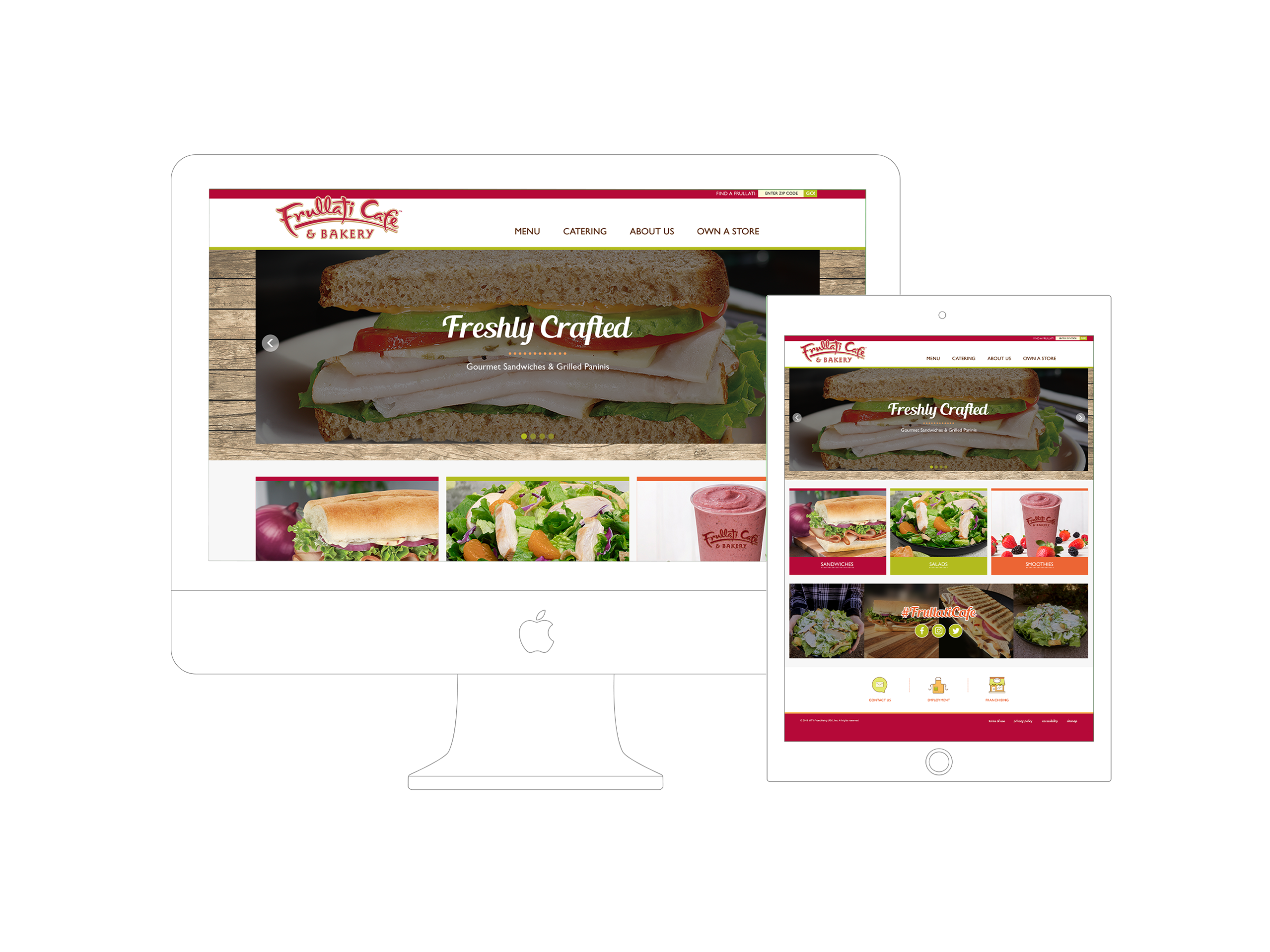
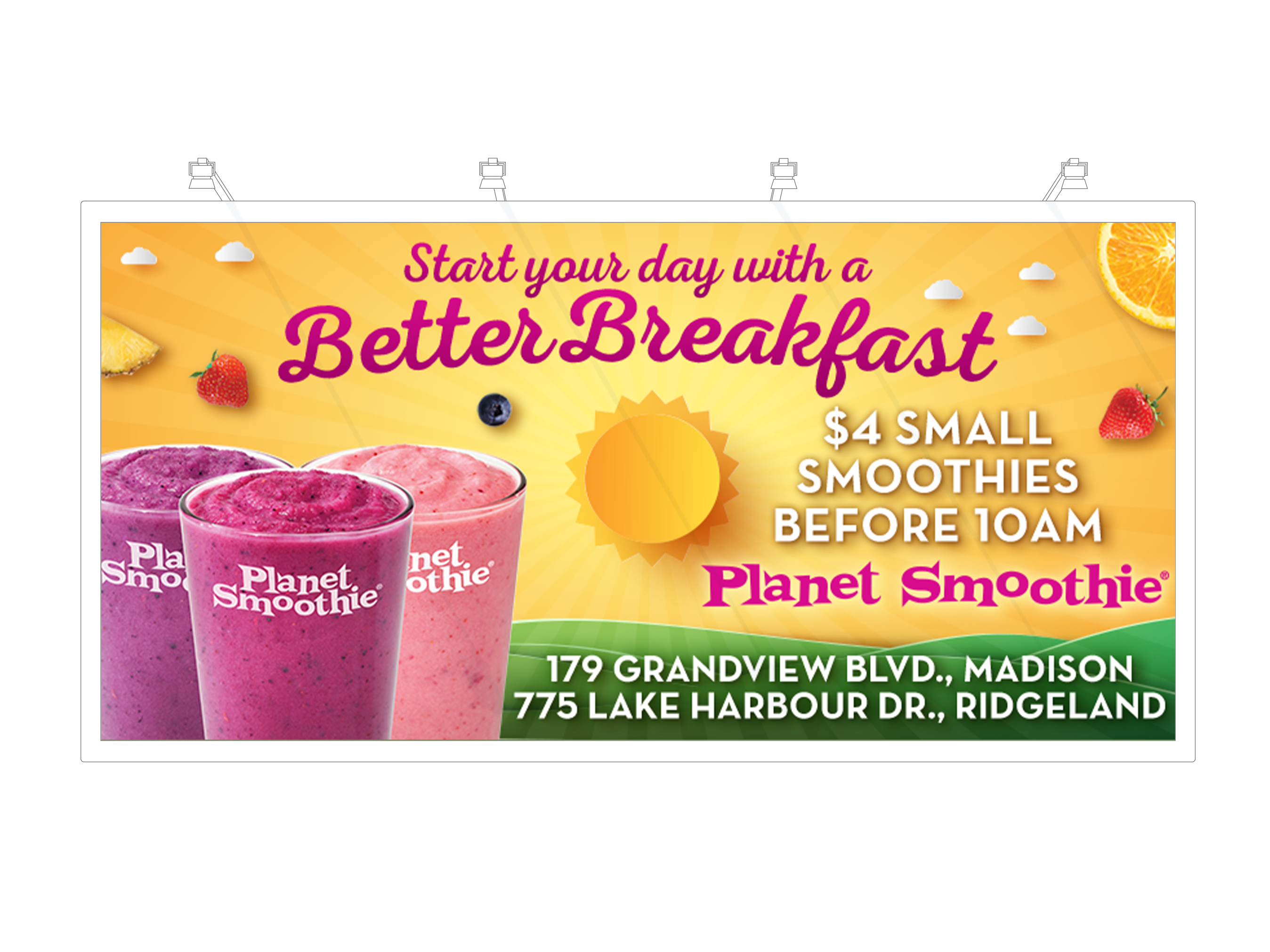
Users interested in NRGize’s menu — which includes fruit smoothies, protein blends, and “beneficial blends” tailored to different wellness goals — needed a digital interface that made choices easy and appealing. Research indicated that health-oriented customers expect quick access to nutritional details, product categories, and a seamless browsing experience — especially on mobile devices during workouts or between errands.
/ Design Process
The design process for the NRGize Juice project followed a user-centered, iterative approach:
a. Discovery & Research
Brand & Market Context: Investigated NRGize’s positioning as a health-focused smoothie franchise that appeals to active lifestyles and gym visitors. The menu emphasizes low calories and tailored nutrition blends.
Audience Needs: Prioritized features that help users quickly browse categories (e.g., Fruit Smoothies, Protein Smoothies, Beneficial Blends) and understand ingredient and nutrition information.
b. Information Architecture & UX Flow
Mapped out how key content (menu, benefits, brand story) should be organized to improve user task completion — like finding a favorite smoothie category or learning about nutrient contents.
Prioritized mobile-first navigation for users accessing the site via phones at gyms or while out and about.
c. Wireframing & UI Layout
Created initial wireframes to establish the layout hierarchy, ensuring that high-impact visuals and key calls-to-action (e.g., “Explore Menu”, “Find a Location”) were prominent.
Ensured responsiveness for multiple breakpoints (desktop, tablet, phone).
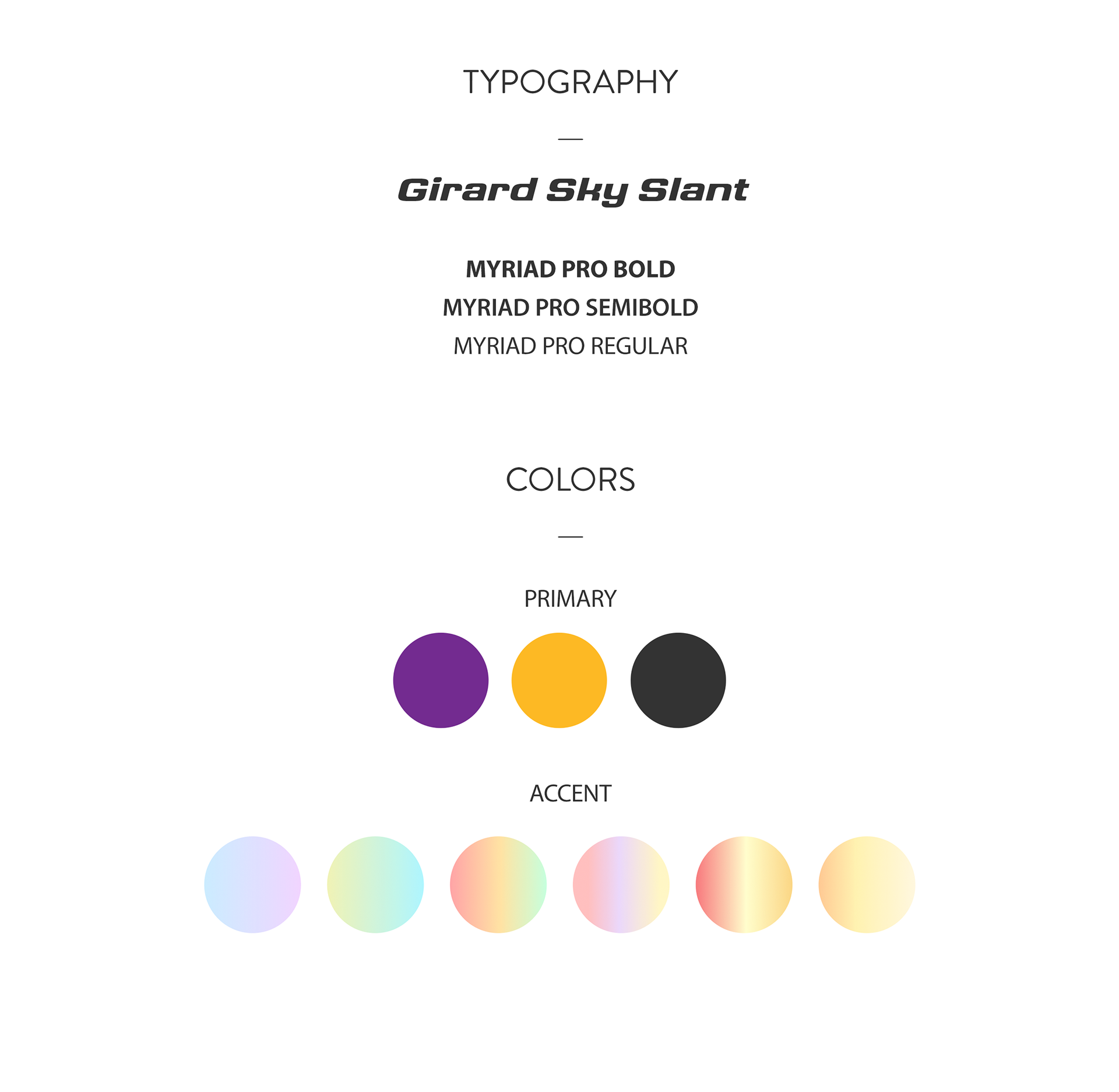
d. Visual Design & Branding
Developed UI elements that reflected the energetic colors and fresh produce vibe associated with NRGize.
Focused on bold typography and imagery of smoothies and juices to visually communicate flavor and health benefits.
e. Prototype, Review & Iteration
Built clickable prototypes to validate navigation flows and responsiveness.
Incorporated feedback loops to refine visual consistency and improve text readability, especially on smaller screens.
f. Final Design & Handoff
Delivered polished screens ready for development, with clear layout specs and style guidelines.
Included responsive component patterns and interaction feedback to support future developers and stakeholders.