
/ Overview
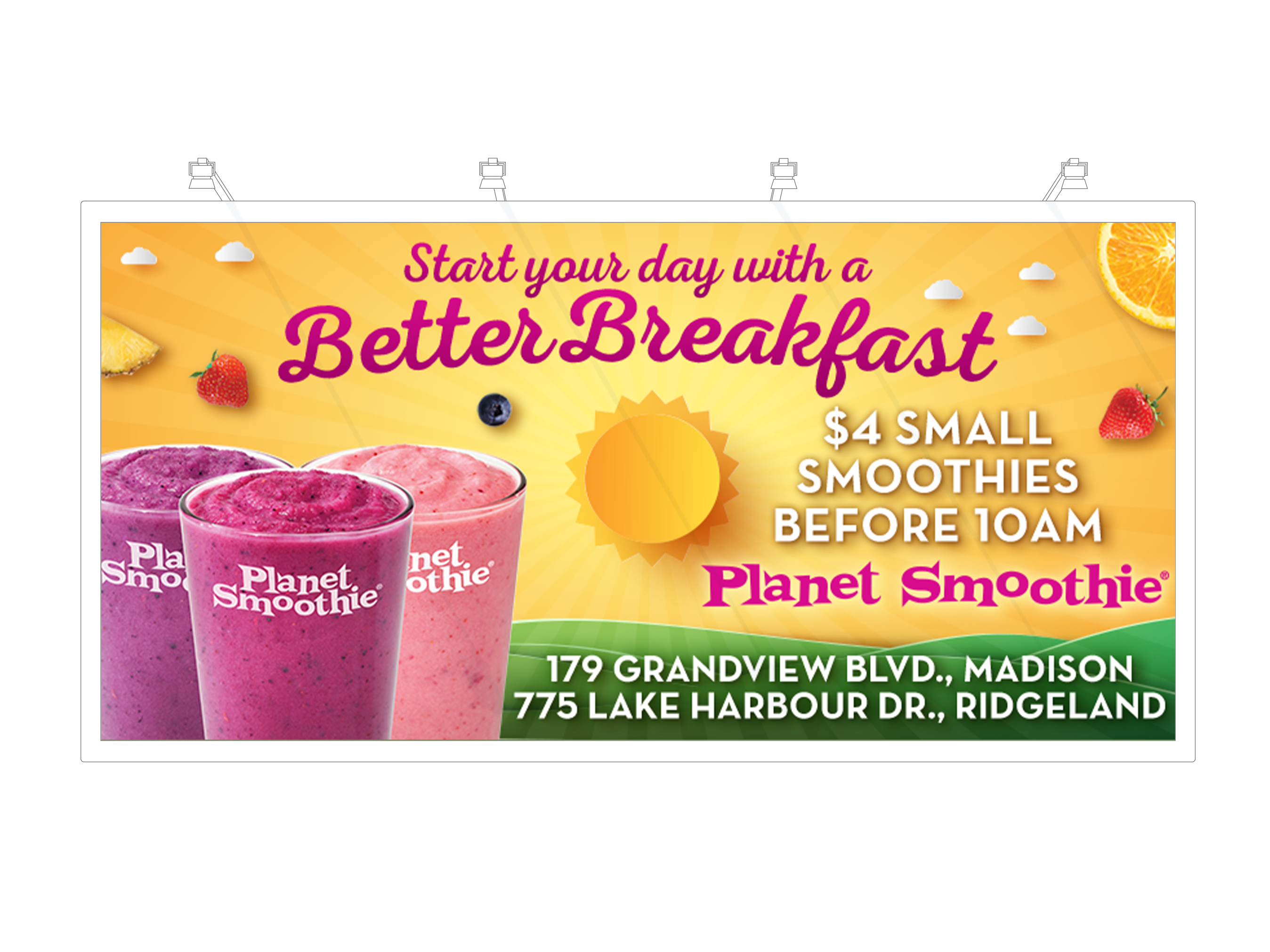
Frullati Café & Bakery is a quick-service café brand known for its wholesome, freshly prepared menu featuring real fruit smoothies, grilled paninis, crisp salads, handcrafted sandwiches, bakery items, and refreshing beverages. Founded in the mid-1980s, the Frullati concept blends café-style food with real-fruit blended drinks, offering customers healthier alternatives to traditional fast food.
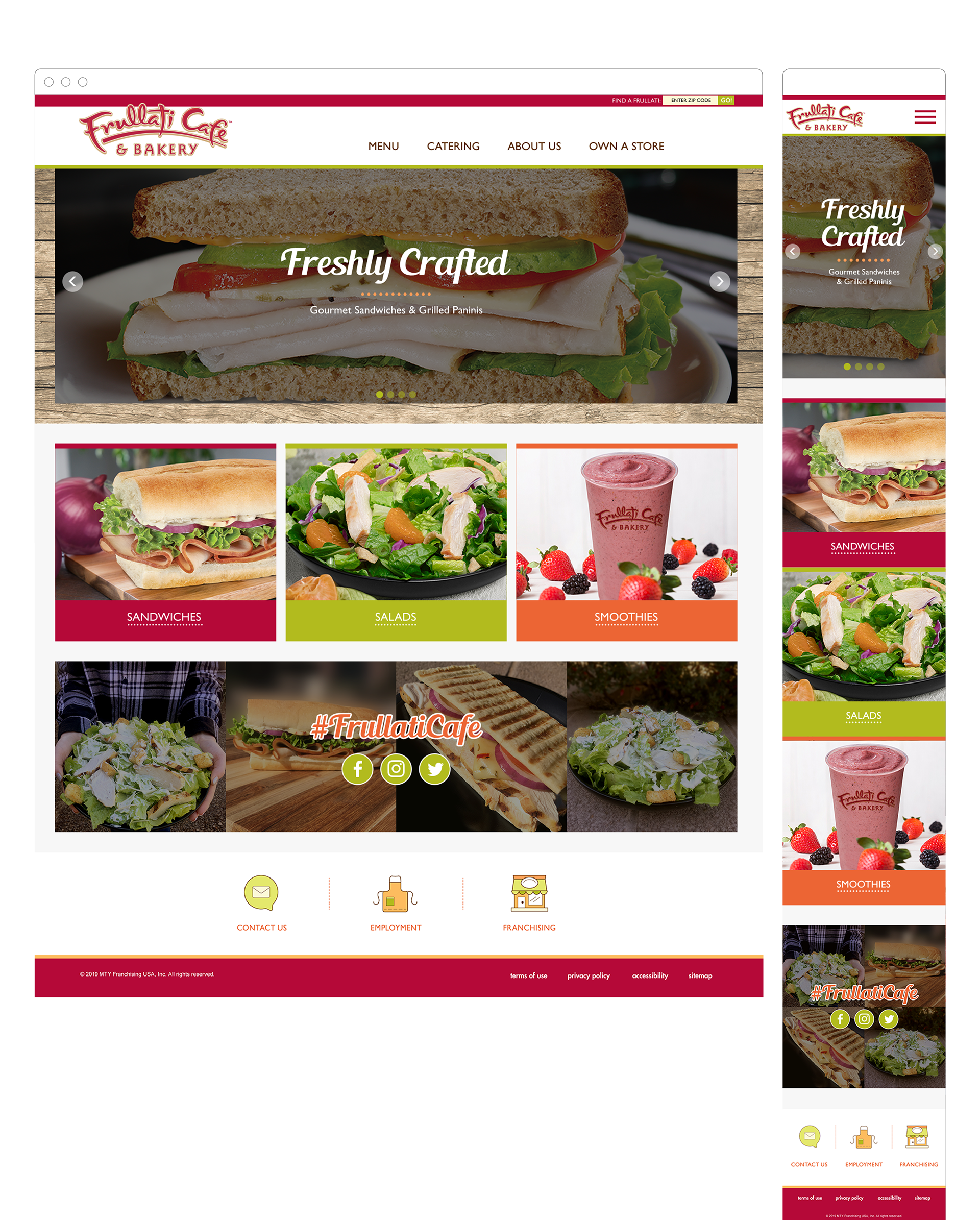
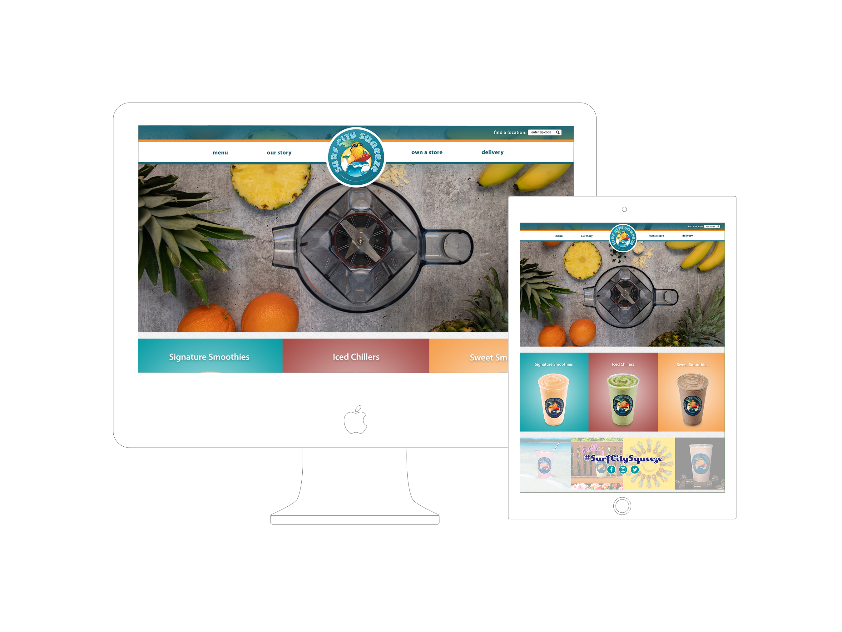
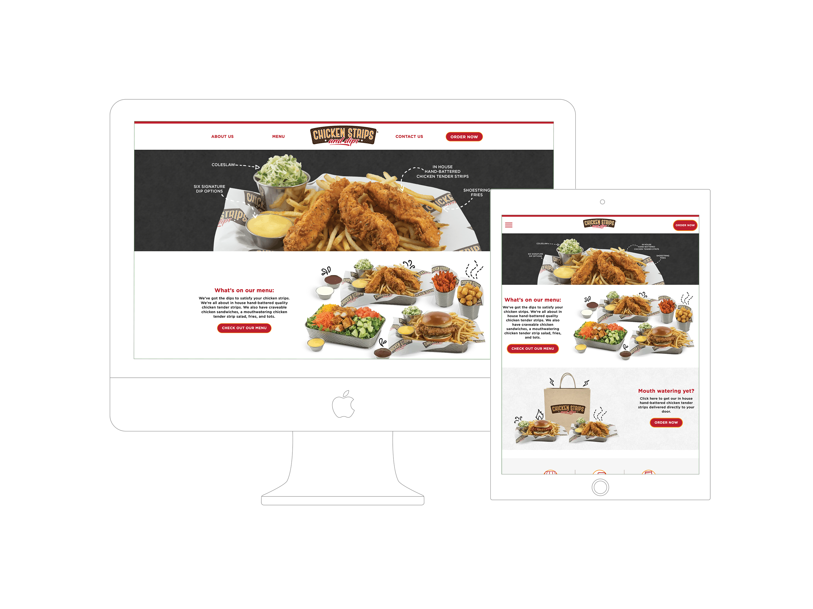
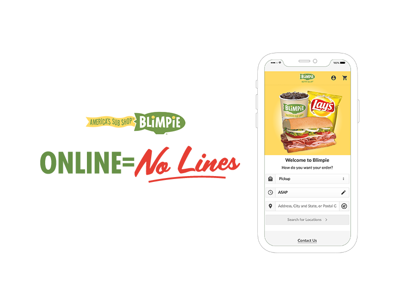
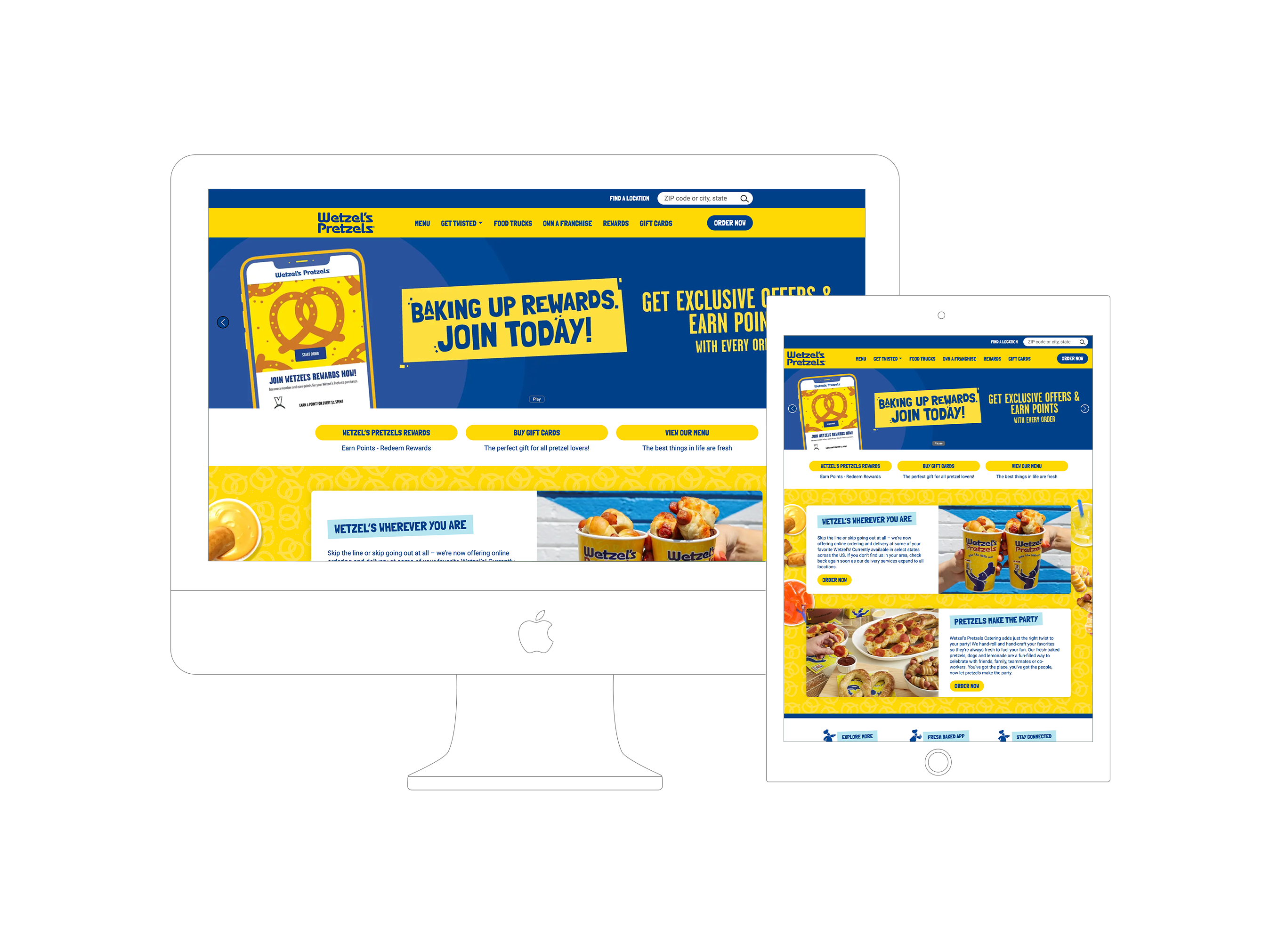
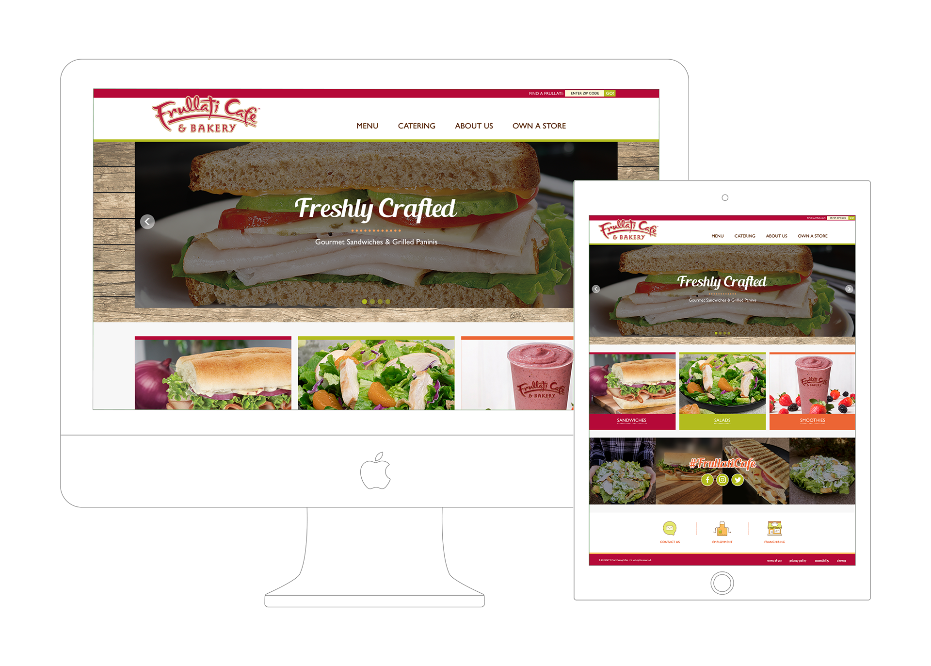
The Frullati Website project was conceived to provide a clean, engaging, and responsive online experience that reflects the brand’s focus on fresh food and inviting atmosphere. The goal was to make essential content — such as menu exploration, location finders, and brand story — easily discoverable across devices, capturing the brand’s approachable and fresh-flavored personality in digital form.
/ Problem
Prior to this design, the digital presentation of Frullati lacked a cohesive brand alignment and user flow that matched the quality and breadth of its menu offerings. Key challenges included:
• Unclear Content Structure: Frullati’s diverse offerings — from smoothies and beverages to paninis and salads — needed better categorization and visual grouping for quicker comprehension.
• Mobile Usability: As more users browse on mobile devices, the experience needed optimization for touch navigation, clear calls to action, and effortless menu discovery.
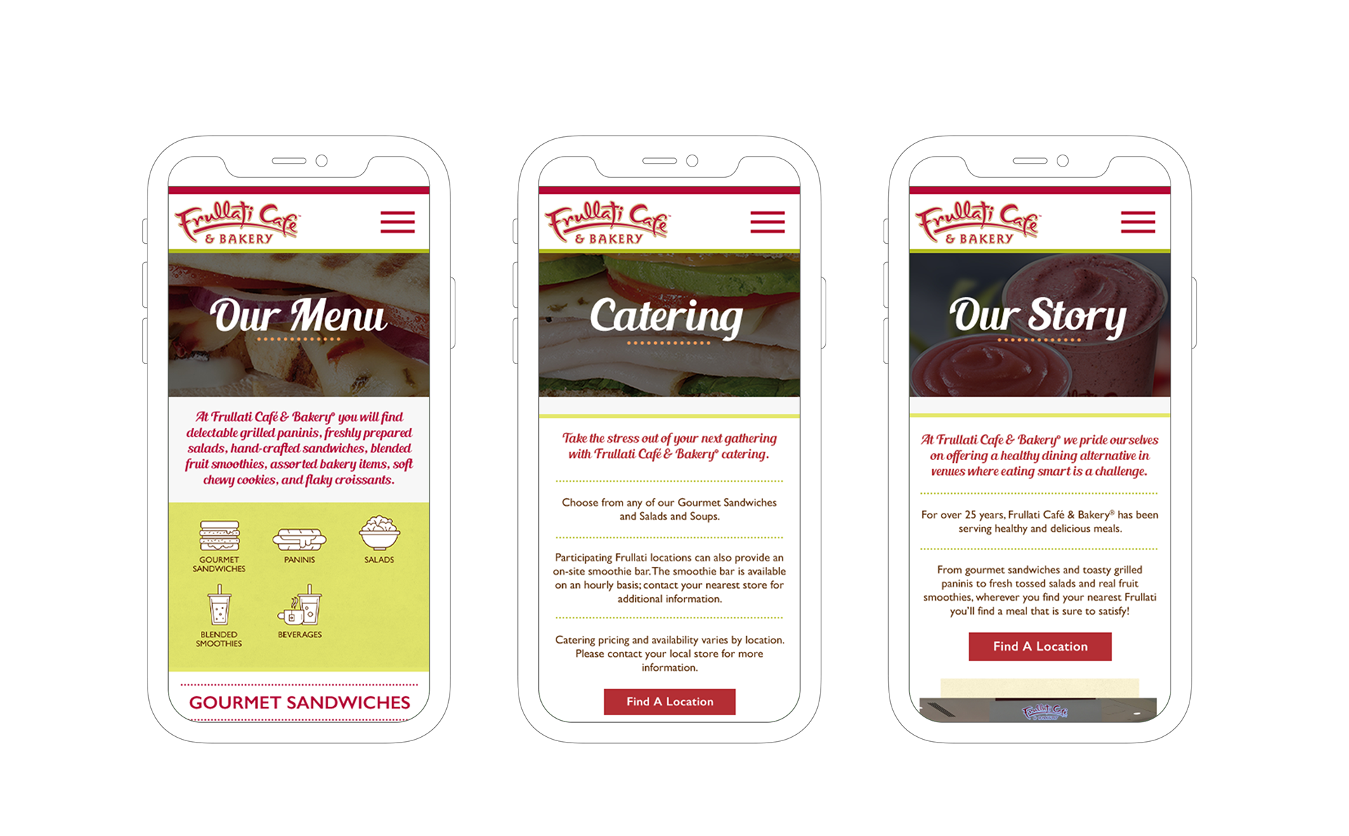
• Brand Storytelling: The website needed stronger presentation of the brand’s heritage and values to connect with visitors and reinforce Frullati as a healthy and flavorful choice.
These issues made it harder for users to quickly understand what Frullati offers and take action — such as finding a store location or exploring menu categories — especially on smaller screens.
/ Design Process
The Frullati Website was developed through a structured, user-centric design process that balanced layout clarity with visual appeal:
a. Discovery & Brand Understanding
• Brand Context: Researched Frullati’s menu breadth and brand positioning as a café with healthy dining alternatives and freshly blended smoothies.
• User Goals: Identified the core tasks users would want to achieve — such as browsing the menu, learning about offerings (smoothies, salads, sandwiches), and locating the nearest store.
b. Information Architecture & User Journeys
• Built out a content hierarchy that grouped similar offerings together (e.g., smoothies vs. food) and mapped common user journeys — like “Find a smoothie” → “View nutrition/menu” → “Find a location.”
• Designed navigation that made key categories accessible with minimal clicks.
c. Wireframing & Page Structure
• Created low-fidelity wireframes to test layout of major pages such as the homepage, menu pages, and location finder.
• Prioritized responsive behavior so that layout modules adapt seamlessly from desktop to mobile screens.
d. Visual Design & UI Elements
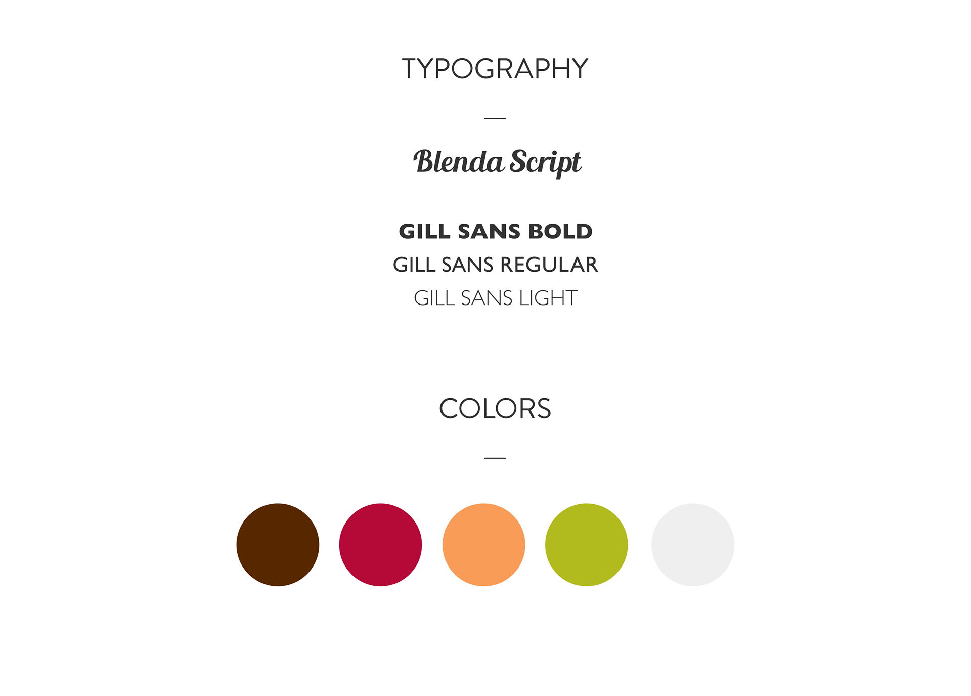
• Color System: Used fresh and appetizing colors that complemented the food and drink imagery.
• Typography: Applied legible and friendly typography that improved readability and matched the approachable brand personality.
• High-impact imagery of smoothies and menu items helped reinforce the brand’s fresh, flavorful message.
e. Prototype & User Feedback
• Developed interactive prototypes to review click behavior and content visibility across devices.
• Iterated based on feedback to refine spacing, hierarchy, and call-to-action prominence.
f. Final Design & Handoff
• Delivered final responsive UI designs with detailed specs for desktop, tablet, and mobile.
• Included a style guide with color, typography, and reusable components to support development and future scalability.